FILMU
Branded Product Design
FILMU is a 35mm color film brand. It is unique and different from other 35mm color films because, in recent years, the price of 35mm color film has kept increasing and overwhelming customers. FILMU does not want people to not retain their interest because of this, so our brand expects to offer valuable and affordable 35mm color film. FILMU's target audience will be everyone passionate about using film cameras or photography. You don't need to be professional to use our 35mm color film. Our products are designed for any level of photographer to capture their memories. In FILMU, each film is unique to represent all of us joyfully. Let's smile and says cheese!
Year: 2023
Roles: Logo Design, Graphic Design, Branding, Packaging, Layout and Typography Design
Skills: Adobe Illustrator, Adobe Photoshop, Adobe InDesign, mock-up, printing
Logo and Wordmark Develop
FILMU has two primary logos that will depend on the situation and use them differently. The wordmark is for use in the primary visual such as packaging, stationery pieces, or some places that can fit horizontally well; The logo is for use in the outer packaging (box) and website, etc. The concept behind them combines 35mm color film and the smile, so I decided to make both logo and wordmark in a lovely and inviting style. Both are willing to bring joyful, playful, and fun emotions to customers, allowing them to show our brand's style and personality in the initial impression.
Packaging
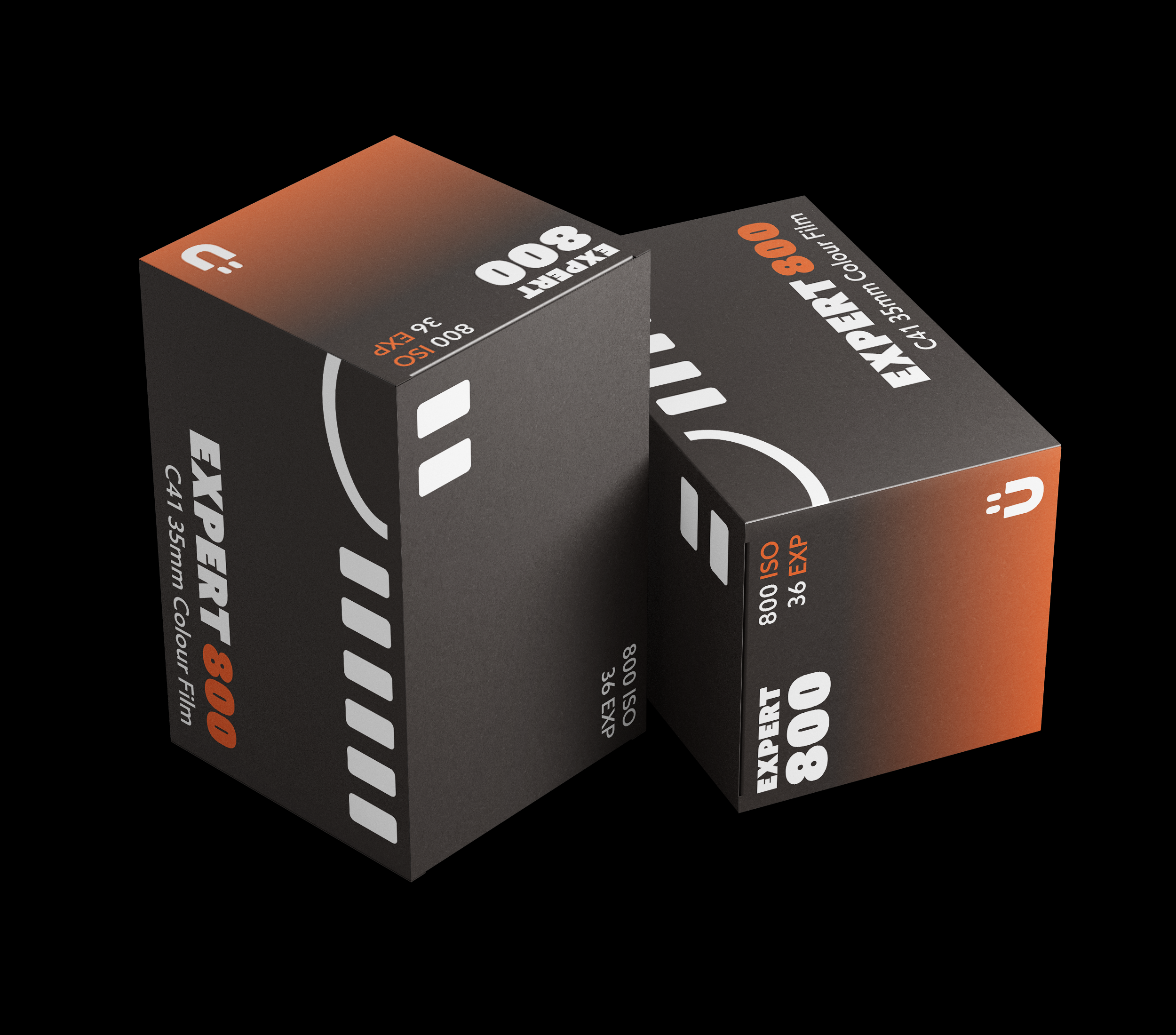
FILMU's packaging is a small rectangle box size 3.8*4*6 that can perfectly fit the 35mm color film canister containers. Since our target audience is everyone who loves film cameras, we created three series that provide the different needs of various levels of people. They are BEGINNER 200, EXPLORER 400, and EXPERT 800, and the difference between them is the ISO and exposure.
Stationery Develop
FILMU logo's central concept is our classic smiley face and the 35mm film strip. And I decided to make it our representation, primarily, the brand maintains this idea around everything across stationery, such as in the FILMU wordmark, the "U" has two little eyes on it and looks like a smiley face. I decided to extend this as FILM's individual and iconic emoji and make it appear in packaging and brand stationery items. When people see this unique smiley face shows up in either stationery or tote baf, they can immediately recognize our brand.


